Pizza Hut Global Order Tracker
Brief summary: to lead design of the Pizza Hut Global Order Tracker to be used across 14 global markets (web and app). It needed to integrate with local POS systems and the existing Dragontail back-end.
Goal: to improve customer satisfaction and as a result drive an increase in positive reviews and app ratings. To better inform and update customers on the progress of their order (as this was a big frustration). I also saw this as a great opportunity to bring in some brand 'delight'. This project wasn't a conversion driver so could be more playful: it would be one of the final areas that would be seen before receiving the food and an opportunity for the user to connect with the brand.
Role: Lead Designer. I directly worked with an illustrator/animator and Product Manager and led conversations with markets, stakeholders and developers.
Shows the Order Tracker and some of the stages
Research
This was the old experience. Research was clear on how poor the current experience was: user interviews showed that people were confused with what was happening and there wasn’t enough information or reassurance.

In all markets, there was frustration from customers. Although it’s not a conversion driver, it’s a key point in the journey and the company were potentially losing large numbers of customers. A lot of the complaints were out of our control (e.g. cold or late pizza), but there were areas we could improve.
Principles and wireframes
Wireframes. There were a number of stages of development and multiple conversations with markets, developers and stakeholders. The idea was to keep it as simple as possible and reduce information to only that which was needed.
Higher fidelity. These captured what we wanted for the UI. The placeholder image was to be left for animations which would give that brand ‘delight’.
Design principles based on research (and considering tech and market constraints):
Estimated arrival time should be given as a staged progress bar to reassure the customer that it’s being prepared or on the way.
Give full transparency on what is happening. Communicate each stage of the process
Make sure the Tracker always appears active so the customer knows it’s progressing
Use time range rather than exact time e.g. ‘19:15-19:25’. This is to set expectation and give the delivery driver leeway in case they get stuck in traffic or can’t get into a building (particularly an issue in markets like India)
Show order details and enable customer to easily contact the local Hut
A summary of our objectives
Brand elements
The next stage of the project was to add some brand ‘delight’ through animation. We had workshops with key stakeholders to make sure it was on-brand. We wanted to be playful and bold in the approach.
Took a number of illustration styles including existing Pizza Hut examples (from across the globe)

We benchmarked these against brand guidelines and the type of contemporary feel we were going for

Chose a few potential directions, then aligned with the brand team. We chose this retro but contemporary style with reduced colour palette

Worked with an illustrator/animator to mock up a few ideas in different scenarios

We wanted to bring a personality and some humour
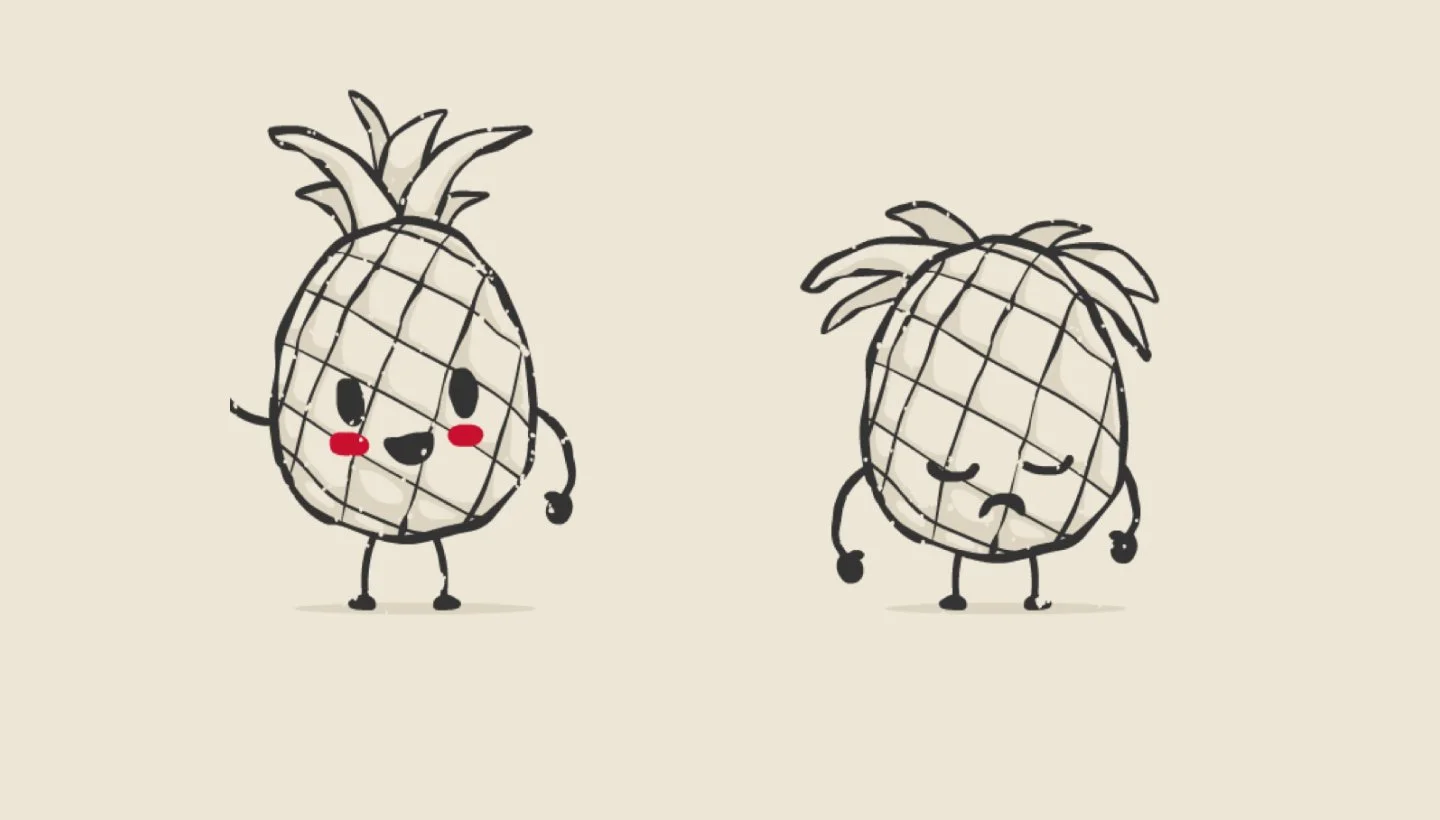
One example of humour was the ‘controversial pineapple’. Pineapple on pizza always seems to come up in social media (a lot of people hate it) so we wanted to push this
These were the final characters and status that we went for. They were updated according to the market. E.g. some markets didn’t have pineapple on pizza so we switched it to tomatos.
Live designs

Desktop version showing a customer choosing to get their food Delivered

Desktop version showing a customer choosing to collect their food. The design for this is much simplified as we found that the stages and animations were unnecessary as customers will only look at this to check the address and confirmation.

Mobile is by far our highest channel so all designs were mobile-first
Showing an animated gif of the full journey
Outcome
This was not something that would affect conversion and it was not possible to see how it affected repeat customers or future orders. But we know that:
Customers stayed on the website / app after ordering for longer. It varied between markets but there was consistent uplift. This shows that it helped engage the user
In surveys, rating the old experience vs the new one, we saw clear uplift in positive sentiment and excitement
The number of negative reviews were pretty consistent (pre and post the new design). This is down to issues out of control on this specific brief e.g. late deliveries, cold pizza, bad customer service, wrong orders